When it comes to branding and photography, color isn’t just a design choice—it’s a powerful psychological tool. Every color triggers emotional responses, shapes perceptions, and even influences buying decisions. In a crowded digital landscape, mastering the psychology of colors gives your brand a serious advantage. It can mean the difference between capturing attention and blending into the noise. At CrowdBoost Marketing, we help businesses create unforgettable brands by leveraging the strategic power of colors in photography, web design, advertisements, and social media presence. Our expertise in the psychology of colors allows brands to communicate more effectively with their target audience, creating visual experiences that resonate long after the first impression.
Understanding the Basics:
Helpful Facts
- Color influences up to 90% of first impressions in branding.
- Red excites, blue builds trust, yellow energizes, green signals growth, black conveys luxury, and purple inspires creativity.
- Consistent color use strengthens brand recognition and loyalty.
- Strategic color placement boosts engagement, conversions, and memory retention.
- Top brands like McDonald's and Tiffany & Co. use color psychology to dominate their markets.
How Color Psychology Works
Color psychology explores how different hues impact human behavior and emotions. Studies show that people make subconscious judgments about a product, website, or advertisement within 90 seconds—and up to 90% of that assessment is based on color alone. This immediate impact makes color one of your most valuable branding tools.
Colors influence us in three primary ways:
- Emotionally: Colors evoke specific feelings like excitement, trust, calmness, or urgency
- Cognitively: Colors improve memory retention and brand recognition
- Behaviorally: Certain colors can drive actions, encouraging purchases or building loyalty
For brands seeking to create meaningful connections, understanding these psychological cues is essential to crafting messaging that resonates with target audiences. The strategic use of color can transform ordinary brand assets into powerful communication tools.
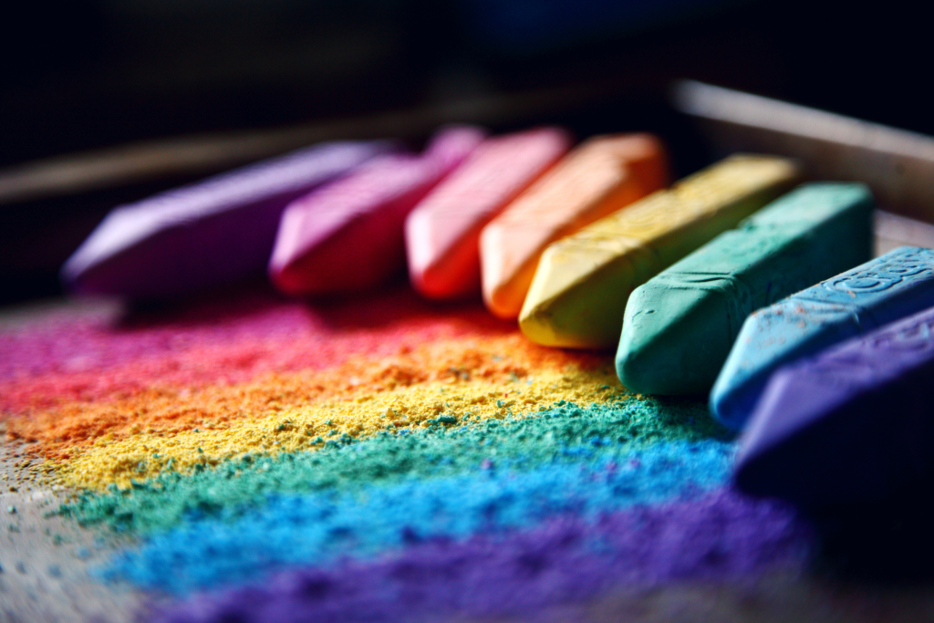
The Meaning Behind Common Colors in Branding
Each color carries distinct emotional associations that can strengthen your brand message when used strategically. Understanding these associations helps create visual coherence across all brand touch points.
Red
Conveying energy, passion, and urgency, red is perfect for brands wanting to evoke excitement or boldness. Think Coca-Cola. Think Netflix. And Target. In photography, use red sparingly to highlight focal points or promotions that demand immediate attention. Red can increase heart rate and create a sense of urgency that drives action.
Blue
Feelings of trust, calm, and reliability all represent the color blue; making it ideal for financial institutions, healthcare providers, and tech brands such as PayPal, IBM, and Facebook. Cool blue tones in photography create a serene, professional atmosphere that builds confidence. Studies show blue is the most universally preferred color across cultures, making it a safe choice for global brands.
Yellow
Representing optimism, warmth, and happiness, yellow is used by brands targeting youthful demographics, like McDonald’s, Snapchat, and IKEA. When incorporating yellow in your visual content, consider pairing it with neutrals to prevent overwhelming your audience. Yellow catches attention faster than any other color, making it excellent for highlighting key information.
Green
The color that embodies growth, health, and nature. Wellness brands, eco-friendly companies, and even finance sectors like Whole Foods, Spotify, and Starbucks use green to convey freshness and reliability. Natural greens in photography add authenticity and create a relaxing visual experience. Green is also associated with wealth and abundance, making it suitable for financial service brands.
Black
If you want to communicate sophistication, luxury, and power, black is your color. High-end brands, fashion houses, and tech products like Chanel, Nike, and Apple use black to project elegance. In photography, black backgrounds create dramatic contrast and focus viewers’ attention on the subject. Black can add weight and importance to lightweight products, increasing perceived value.
Purple
The color of creativity, royalty, and imagination. It works well for beauty brands, educational platforms, and creative agencies like Hallmark, Cadbury, and Yahoo. Purple tones add a sense of mystery and exclusivity to photography, perfect for premium products and services that want to stand apart from competitors.
How Colors Shape Brand Identity
Choosing the right colors goes beyond aesthetics—it’s about building a cohesive brand identity that customers instantly recognize and trust. Colors create powerful first impressions, often being the first element someone notices about your brand. A defined color palette builds brand familiarity across all platforms, while emotionally aligned colors reinforce your brand’s core message and values.
The strategic role of color in branding includes:
- Creating instant recognition (think Tiffany blue or Coca-Cola red)
- Differentiating from competitors in your industry
- Communicating brand personality without words
- Building consistent experiences across digital and physical touchpoints
For example, a fitness brand aiming to project high energy might focus on vibrant reds and oranges, while a wellness brand might lean heavily into calming greens and whites. This alignment between colors and brand purpose creates authentic connections with target audiences.
At CrowdBoost Marketing, we guide our clients through customized brand color audits to ensure every visual element aligns with their ideal audience and business goals. This strategic approach transforms simple color choices into powerful communication tools that drive business results.
Best Practices for Using Color in Photography and Branding
Creating impact through color requires thoughtful implementation across all brand assets. Here are key strategies for maximizing the effectiveness of your color choices:
- Align with audience preferences: Research demographic preferences, as age, culture, and lifestyle heavily influence color perception
- Create visual hierarchy: Use strategic contrast to draw attention to calls-to-action, key information, or hero images that drive conversions
- Maintain consistency: Limit your brand colors to 2–4 core hues across your website, social media, advertisements, and printed materials
- Test across platforms: Colors display differently across devices and mediums—ensure consistent impact through thorough testing
- Consider color relationships: Understand complementary, analogous, and triadic color schemes to create visually appealing combinations
In photography, use deliberate color placement to guide viewers’ eyes exactly where you want their attention—whether highlighting a product feature, emphasizing a person, or reinforcing a message. This subtle direction enhances the effectiveness of your visual storytelling and improves engagement with your content.
Color is also contextual—the same hue can evoke different responses depending on surrounding colors, cultural context, and industry norms. At CrowdBoost, we analyze these contextual factors to ensure your color strategy aligns perfectly with your business objectives.
Real-World Examples of Color Success
Several iconic brands have built their empires largely on strategic color psychology:
- McDonald’s combines red and yellow to stimulate hunger while creating a sense of urgency—perfect for fast food
- Tiffany & Co.’s distinctive blue evokes luxury, exclusivity, and calm sophistication, instantly recognizable worldwide
- Spotify’s vibrant green symbolizes growth, innovation, and connection—key pillars for a music streaming platform
- Coca-Cola’s dominant red creates excitement and passion while stimulating appetite and action
These brands demonstrate that color isn’t an afterthought—it’s a core driver of identity and business growth. Their success stories inspire our approach at CrowdBoost Marketing, where we help clients create equally memorable visual identities through strategic color implementation.
Using Color Psychology to Boost Your Brand
The psychology of colors in photography and branding isn’t about picking favorites—it’s about choosing hues that support your business goals, resonate with your target audience, and differentiate your brand in competitive markets. Strategic color implementation creates emotional connections that drive engagement and loyalty.
When used effectively, colors can:
- Reduce bounce rates on websites by creating visual interest
- Increase time spent engaging with your content
- Improve conversion rates through strategic call-to-action highlighting
- Build stronger emotional connections with your target audience
- Enhance memory retention of your brand messaging
Ready to Build Color Strategy that Converts?
At CrowdBoost Marketing, we specialize in helping brands go from concept to fully realized identities with color strategies that convert. Whether you’re a new business or rebranding an established one, our team helps you define, express, and promote your brand with confidence through strategic color psychology and powerful visual elements.
Call us at (818) 303-1731 or contact us online to start building a brand that leverages color psychology to grow with your business.